
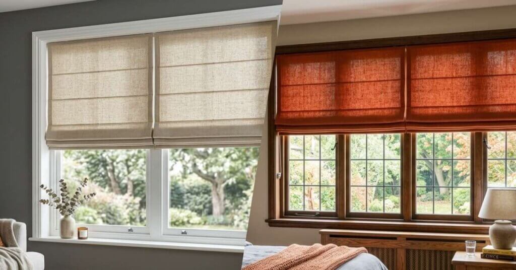
The right Roman shade color should complement your room while giving you the light control and privacy you need. Neutral tones create a calm, flexible backdrop. Bold colors and patterns can turn windows into a statement feature. Consider the room’s size, the amount of natural light, and your long-term design goals before making a choice. Think about how the window treatment will work with your furnishings and everyday routine.

Start With the Room
Roman shades combine the softness of drapery with the clean function of structured window coverings. Since their fabrics remain visible when lowered, color plays a major role in how the finished treatments affect the room.
Before comparing neutral and bold shades, review what is already in the space:
- Wall and trim colors
- Flooring and large furniture
- Existing accents or patterns
- Amount of natural light
- Overall modern or classic style
A shade does not need to match every surface. It should connect with one or two established tones so the room feels intentional rather than overly coordinated.
Consider Natural Light
Sunlight changes how colors appear. A warm beige may look creamy in a bright south-facing room but slightly gray in a darker space. Vibrant hues can also appear stronger near large windows.
Review fabric samples at different times of day. This helps you understand how the material looks under daylight and interior lighting.

When Neutrals Work Best
Popular neutral Roman shade colors include white, ivory, and beige. Taupe, gray, and muted earth tones are also common choices. These subtle palettes are practical when you want the windows to complement the room without becoming its main feature.
Neutrals often work well in:
- Rooms with patterned rugs or bold artwork
- Open floor plans with connected spaces
- Homes with frequently changing decor
- Bedrooms designed for a calm atmosphere
Neutral does not have to mean plain. Woven fabrics, soft textures, or understated patterns add depth without creating visual clutter. A warm linen shade can soften a modern room, while a crisp solid may suit a more tailored design.
Light neutrals can also help smaller rooms feel more open. Dark neutral shades provide stronger contrasts and can frame a window with a grounded, polished appearance.

When Bold Colors Fit
Bold Roman shades make the windows part of the room’s design. Deep blues and forest greens add depth and contrast. Rich rust tones and other vibrant colors can create a striking focal point.
Bold designs are especially effective when:
- The surrounding walls are neutral
- The room needs a defining accent
- The shade color appears elsewhere in the decor
- You want a custom, layered appearance
Patterns can also add personality. Geometric prints support modern styling, while floral or traditional designs may feel more classic. Keep the scale of the pattern in proportion to the window. Large patterns usually work best across wide windows, while smaller designs can suit compact spaces.
Create Visual Connections
Repeat the shade color through smaller accents such as pillows, artwork, or decorative objects. The pieces do not need to match exactly. Related hues are often enough to make bold window treatments feel connected to the rest of the room.

Neutral interiors don’t have to feel plain. Discover how bold patterned Roman shades can become a striking focal point while keeping your space balanced and timeless. Read here!
Compare Your Options
Design goal | Recommended direction |
Calm and flexible | Light or muted neutrals |
Warm and textured | Woven neutral fabrics |
Strong focal point | Bold solids |
Added movement | Patterned Roman shades |
Dramatic contrast | Dark tones against light walls |
Easy future updates | Subtle, versatile colors |
Roman shades can also be paired with curtains or drapery for added softness. In layered designs, choose one dominant element. A bold shade often works best with simple curtain panels, while neutral shades can support patterned drapery.

Frequently Asked Questions About Roman Shades Colors
1. Should Roman shades match the wall color?
They do not need to match exactly. Choosing a related tone can create a subtle transition, while a contrasting color makes the window more noticeable.
2. Do dark Roman shades make a room look smaller?
Dark shades can make windows feel more defined. In a small room, balance them with light walls and simple furnishings to prevent the space from feeling visually heavy.
3. Are neutral Roman shades easier to decorate around?
Yes. Neutral shades work with a wider range of palettes and allow you to change accents without replacing the window treatments.
4. Can I use patterned Roman shades with patterned furniture?
You can, but vary the scale of the patterns. Pair a large print with a smaller design and use a shared color to keep the room cohesive.
5. Should Roman shades match the window trim?
Matching the trim creates a clean, blended look. Choosing a contrasting shade color can make the window feel more defined and decorative.
Find Your Best Color Match

Selecting Roman shades colors becomes easier when you decide what role the windows should play. Neutrals provide flexibility and support other features in the room. Bold colors add energy, contrast, and a stronger sense of personality.
Think beyond the current trend and consider how the shades will look with future furniture or paint updates. Seeing fabric samples in your own space makes it easier to compare colors, textures, and light-filtering performance before making a decision. Made in the Shade Little Rock will help you find a Roman shade that complements your windows, your décor, and the way you live. Schedule your in-home consultation to get started.