
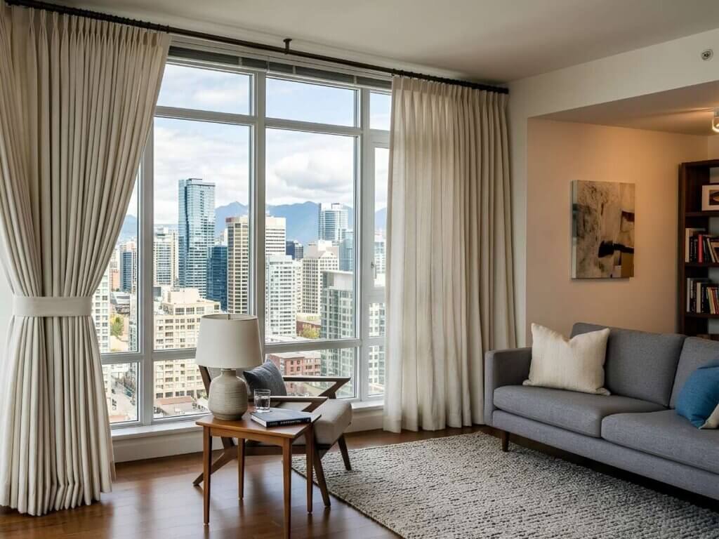
Choosing the right drapery colors can completely transform how your space feels. The key is understanding how color, tone, and contrast work together. Whether you prefer a subtle, monochromatic aesthetic or bold contrast, the right approach helps your curtains complement your walls while enhancing light, texture, and overall harmony.

Why Drapery Color Matching Matters
The relationship between your walls, paint, and drapery fabric affects:
- Visual balance – Avoid overpowering or underwhelming the space
- Light perception – Lighter shades reflect light, darker tones absorb it
- Room mood – Soft neutrals feel calm, bold hues feel expressive
- Design cohesion – Proper matching creates a polished, intentional look
4 Proven Ways to Match Drapery Colors
Go Monochromatic for a Seamless Look
A monochromatic palette uses variations of the same color family.
- Choose drapery in a slightly lighter or darker shade than your walls
- Works well in minimalist and modern interiors
- Creates a soft, cohesive, and chic aesthetic
Example: Light gray walls + charcoal gray drapery

Use Contrast to Add Visual Interest
If your walls are neutral, introduce contrast with your curtains.
- Pair beige or white walls with deep navy, forest green, or bold tones
- Adds dimension without overwhelming the room
- Enhances focal points like windows or architectural features

Pull from Existing Accents
Tie your drapery color into your existing decor accents.
- Match tones from throw pillows, rugs, or artwork
- Keeps your palette unified without being repetitive
- Supports layered interior styling

Let Texture Do the Work
Sometimes color isn’t the main feature; texture and textiles are.
- Use woven, linen, or patterned fabric to add depth
- Great for neutral spaces needing dimension
- Works well with layering techniques

Quick Reference Table: Matching Strategies
Wall Color Type | Drapery Approach | Resulting Effect |
Neutral walls | Bold contrast colors | Dramatic, modern look |
Bold walls | Soft neutral drapery | Balanced and calming |
Monochrome walls | Same-tone drapery | Seamless and elegant |
Textured paint | Simple fabric drapery | Clean and refined |
Common Mistakes to Avoid
- Exact color matching – Can feel flat without variation in tone or texture
- Ignoring undertones – Warm vs. cool hues must align
- Overcomplicating the palette – Too many colors disrupt harmony
- Forgetting hardware – Curtain rods and hardware finishes should complement your overall design

How to Choose the Right Shade
When narrowing down your options, consider:
- Lighting conditions – Natural light changes how colors appear
- Room function – Bedrooms benefit from softer tones or blackout options
- Fabric weight – Heavier textiles feel formal; lighter ones feel airy
- Trends vs. timelessness – Balance current trends with lasting appeal
Frequently Asked Questions About Drapery Colors
1. Should drapery be lighter or darker than the walls?
Both can work depending on your goal. Lighter drapery creates an airy feel, while darker tones add contrast and depth.
2. Can I mix patterns with colored walls?
Yes, but keep the palette consistent. Choose patterns that include at least one color found in your walls or decor.
3. What are the best neutral drapery colors?
Popular options include white, cream, taupe, and soft gray. These shades blend easily with most interiors and hold up well over time.
4. How many drapery colors should I use in one room?than wood in a humid environment?
Stick to one main drapery color that ties into your existing palette. You can layer subtle accents through trim, patterns, or textures without overwhelming the space.
5. Does hardware color matter when matching drapery?
Absolutely. Finishes like black, brass, or chrome should complement your room’s accents and overall design style.
Bring Your Space Together with the Right Drapery
By understanding how tone, contrast, and texture interact, you can confidently choose window treatments that enhance your overall interior design. Small adjustments, like selecting the right hue or layering textiles, can make a noticeable difference in how your room feels and functions.
At MITS Little Rock, thoughtful window styling starts with understanding your space, your lighting, and your personal aesthetic. If you’re ready to refine your look with custom drapery that complements your walls, schedule a consultation and explore tailored solutions for your home.